Default SwiftUI is the iOS equivalent of AI slop. Left to its own defaults, a general-purpose coding assistant will hand you .body fonts everywhere, flat black or white backgrounds, list rows that run edge-to-edge without structural framing, and screens that look indistinguishable from, for example, the kind of toy app one builds while learning the primitives of SwiftUI. I have created the iOS Design Agent Skill to give Claude Code, Cursor, and the other Agent Skills-aware tools a design critic’s eye when they build or audit iOS interfaces.

The skill is, in spirit if not in literal code, a port of Anthropic’s frontend-design skill for the web. It organizes design critique around five pillars: typography, color cohesion, spatial composition, purposeful motion, and atmospheric depth. It also inherits its parent’s most distinctive commitment, the anti-slop mandate, which is a refusal to ship the generic, template-driven aesthetic that a general-purpose model produces by default. On the web, that default looks like an Inter-flavored Tailwind page. On iOS, it looks like an unstyled List on a flat background.
Installation in Claude Code is two commands:
/plugin marketplace add https://github.com/vermont42/iOS-Design-Agent-Skill
/plugin install ios-design-agent-skill
Cursor marketplace approval is pending; when it lands, the skill will install directly from Cursor. The repository README also documents installation via skills.sh, Gemini CLI, Antigravity, OpenAI Codex, and manual symlinking. Any tool that supports the Agent Skills open format should work.
After install, invoke the skill with a prompt asking for a design critique. The README suggests a bare-bones opener:
Use the iOS design agent skill and audit my app’s UI for typography, color, spatial composition, motion, and depth.
The skill responds with a prioritized audit tied to specific SwiftUI APIs, and, in my experience, the output produces excellent results in a single pass. The repository’s before-and-after gallery shows nine UI improvements in one iOS app.
The rest of this post is the skill’s why. It is the story of how a design methodology written for the web, applied first to a vacation-rental site and then to a German-verb iOS app, turned out to be more portable between platforms than I had any right to expect.
Background: The Fish Condo and the Need for a Design Language
In spring 2026, my wife Amanda and I bought Unit 1903 at Kanaloa at Kona, a small oceanfront condo development on the Big Island of Hawaiʻi. The previous owners had decorated the unit with fish: fish on the bed frame, fish on the pillows, fish on the rug, and a framed fish above the couch. We took one look and affectionately dubbed it “the fish condo.” We now offer the fish condo as a short-term rental on Airbnb and Vrbo.
A short-term rental needs a website. The site is not a booking system. The booking systems are Airbnb and Vrbo. The site is a mood piece. A prospective guest arrives from a booking system wanting to confirm that the place is real, that the hosts are attentive, and that a stay there will match expectations. The website provides this validation. I built it with Claude Code as a static SvelteKit application, and it is live at kanaloa1903.com.
Which brings me to the design problem. I identify, in descending order of confidence, as a writer and as a software developer. I am not a web designer. Left to my own defaults and to the defaults of a general-purpose coding assistant, I would have reached for Inter, three Tailwind grays, a grid of rounded-corner cards, and a call-to-action button in some faintly cheerful color. Maybe a purple gradient. The site would have functioned. It would not have had a point of view. For a Vrbo-and-Airbnb listing that competes on atmosphere, genericness is a failure mode.
I needed a design language. Anthropic’s frontend-design skill gave me one.
What frontend-design Is
frontend-design is a Claude Code skill whose published description reads: “Create distinctive, production-grade frontend interfaces with high design quality.” The SKILL.md opens with an uncommonly frank declaration of its nemesis. The skill exists to produce “distinctive, production-grade frontend interfaces that avoid generic ‘AI slop’ aesthetics.” The quoted phrase is rare in first-party documentation and tells you a great deal about the animating-and-true observation: most AI-generated UI is interchangeable, and being interchangeable is the failure mode to design against.
Before it generates any code, the skill forces a commitment. It names four things the developer must answer up front: Purpose, Tone, Constraints, and Differentiation. The last, in the SKILL.md’s own gloss, is “What makes this UNFORGETTABLE?” The answers are meant to be specific and opinionated. The document enumerates sample tones to choose among, worth quoting for the flavor: “brutally minimal, maximalist chaos, retro-futuristic, organic/natural, luxury/refined, playful/toy-like, editorial/magazine, brutalist/raw, art deco/geometric, soft/pastel, industrial/utilitarian.” The skill inoculates against neutrality.
Typography gets its own dictum. “Avoid generic fonts like Arial and Inter; opt instead for distinctive choices.” That single sentence preempts most of the Inter-flavored sameness that a non-designer would otherwise ship. It points Claude toward the larger and stranger universe of typefaces already sitting free on Google Fonts and in the web stack: display serifs, revived geometric sans, handwritten scripts, technical monospaces, whichever of them serves the committed tone.
Output is production-grade HTML, CSS, and JavaScript, or equivalents in React or Vue. The skill is one of the Agent Skills that Claude loads dynamically when the task warrants, so it is not always in view and does not color unrelated work.
Origin Story
The skill is first-party, authored by Anthropic. The earliest public commit introducing frontend-design to an Anthropic repository is 62c3cbc4 in anthropics/claude-code, dated November 12, 2025. The author of record is Thariq Shihipar, an engineer on Anthropic’s Claude Code team. In keeping with Anthropic’s house convention, the commit message credits Claude itself as a co-author. Hours later the same skill was republished into the anthropics/skills examples repository via PR #98 from Keith Lazuka, which is where it now lives alongside sibling skills for document generation, security review, and other specialized workflows.
The broader context is worth knowing. Agent Skills launched in October 2025 as “folders of instructions, scripts, and resources that agents can discover and load dynamically,” a mechanism for teaching the model repeatable specialized workflows without bloating every prompt. frontend-design was one of the earliest to catch external attention. In April 2026, Anthropic productized it as Claude Design, a consumer-facing product whose backend leans on this same skill.
The motivation, stated plainly in the SKILL.md preamble, is salutary. A general-purpose model asked for a website gives you something competent and forgettable. That outcome is not a failure of the model; it is a failure of the prompt. frontend-design is a carefully written prompt that the developer does not have to write herself. It encodes the taste, the vocabulary, and the commitments that a senior designer would bring to the engagement, and it empowers a non-designer to invoke those commitments by name.
The Prompt
Here is the prompt I gave Claude Code when I wanted three design directions for the fish-condo site. It is the entire contents of prompts/design.md in the project repository.
For my [personal website](https://racecondition.software), I asked you to propose three designs for the site, using the frontend-design skill. You proposed three. I had you implement one. The result was fantastic.

I'd like you to make, using frontend-design skill, three proposals for the fish-condo site. In all three proposals, include the following:

* A descriptive name for the proposal
* A tropical-inspired set of colors (dark mode and light mode) and appropriate fonts
* Subtle-but-engaging animations
* A prompt for Banana-generated imagery, for example a subtle fern watermark
* Responsive
* User-selectable light and dark modes
* On the main page, in desktop (not mobile) mode, a faint, subtle animation that follows the user's cursor
* Anything else that would make the site awesome
* Nano Banana prompt for a logo image that can shrink down to favicon size

Give each proposal a name.
A few things are worth pointing out. First, I gave Claude a precedent: it had used frontend-design on my personal site, and I praised the result. This reference and praise gave the model both useful context and tonal anchoring for its task. Second, I specified the ingredients (tropical palette, dark and light modes, a subtle desktop-only cursor animation, a logo that scales down to favicon size, Nano Banana prompts for imagery) but not the tone. The skill’s whole point is that Claude chooses the tone. I was giving it ingredients, not a recipe. Third, I asked for three proposals explicitly. Seeing several tonal directions side by side makes converging on one easier than iterating on several seriatim.
The Three Proposals
Claude returned three complete, self-contained HTML demos, each with a full design token set, typography, cursor animation, watermark, hero treatment, and footer. Each was tonally distinct from the other two. I offer a brief description of each, drawn from Claude’s own proposals README, and one screenshot per proposal.
Mauka Makai (Hawaiian for “mountain to sea”). The luxury, upscale-resort direction. Reference points, volunteered by Claude: Aman Resorts, Kinfolk, and Cereal magazine. The typeface triad is Cormorant Garamond for display, Libre Baskerville for body text, and Instrument Sans for UI labels and navigation. Three distinctive moves: the Tideline Ripple cursor, a pair of concentric gold rings that expand and fade where the pointer lingers; a pen-and-ink ti-leaf watermark rendered as SVG; and the Golden Hour scroll progress bar, a 3-pixel horizontal rule at the top of the viewport whose gradient runs gold, to deep Pacific blue, to sea mist as you scroll.

Lanai Days. The casual, sun-drenched beach-house direction. Reference points: Airbnb’s best hosts, tropical postcards. The type is Fredoka for display, Nunito Sans for body, and Caveat for handwritten accents in the margins. The hero is framed like a postcard, rotated a degree off true, with a dashed-border stamp box in one corner and a handwritten “wish you were here!” in pink script. Cards are polaroid-style, each rotated a few degrees. The cursor drops fluttering plumeria petals. A first-visit toast says “Aloha! Welcome to Kanaloa 1903.” The footer is an animated SVG wave in turquoise and papaya.

Reef Line. The bold, modern tropical direction. Reference points: Dwell magazine, surf-brand lookbooks. The type is DM Sans for display, IBM Plex Sans for body, and IBM Plex Mono for technical details like the 2BR / 2BA stats and the street address. The hero is a 50/50 split: a flat electric-teal block with an enormous white “KANALOA” set against a coral-and-amber gradient panel. Cursor hover drops small geometric stamps (diamonds, crosses, triangles) cycled through the accent palette. The watermark is a geometric kapa-cloth pattern rather than a botanical one. A stats ribbon below the hero counts up from zero on scroll.

Three proposals, three tonal worlds, one session. Any of the three would have been a defensible production site. I picked Mauka Makai because the listing I was marketing is an oceanfront condo in a boutique development, and the editorial-luxury tone was the closest match to the experience I wanted to sell: refined, luxurious, tasteful.
Implementation: Mauka Makai in Production
Translating the Mauka Makai HTML demo into a SvelteKit application went cleanly because the skill had already done the hard work of picking a consistent design token set. That set lives now in src/app.css as CSS custom properties. The palette:
- Warm Linen (
#F7F5F2) for background - Parchment (
#EDE9E3) for alternate surfaces - Rich Brown (
#2C2420) for body text - Near-Black (
#1B1714) for headings - Deep Pacific (
#1B4965) as the primary accent - Sunset Gold (
#C6923A) as the secondary accent - Sea Mist (
#C8D9D4) as the tertiary, used in gradients and hovers
Dark mode swaps these for a volcanic palette: #1B1714 background, #F5F0EA headings, a brightened #4A8BAF Pacific, a brightened #D4A74A gold. The mode is controlled by a [data-theme] attribute on the <html> element, with prefers-color-scheme: dark as the system fallback. User choice persists to localStorage under the key kanaloa-theme, and a small inline script in the document <head> applies the saved theme before the first paint, so there is no flash of the wrong theme.
Typography loads from Google Fonts. Cormorant Garamond carries the display face, used for page titles and pull quotes in its 300 weight with tight letter-spacing. Libre Baskerville carries the body. Instrument Sans runs the navigation, buttons, and section labels. Type sizes scale fluidly via clamp(), so the hero H1 is clamp(2.5rem, 5vw + 1rem, 4.5rem) and never feels oversized on phones or undersized on a 4K panel.
Three interactive elements carry the personality of the site. The Tideline Ripple cursor-follower attaches a mousemove listener to the <body>, throttled at 50 ms, and injects two concentric expanding rings into the DOM at the pointer’s location, with the second ring delayed 80 ms behind the first so the ripple reads as a single expanding stroke rather than a flat circle. The Golden Hour scroll progress bar is a fixed-position 3-pixel element whose width updates on a passive scroll listener. Feature cards reveal as you scroll them into view, via an IntersectionObserver that applies a .revealed class with a 150 ms stagger between cards. All three effects short-circuit cleanly under prefers-reduced-motion: reduce and on touch-only devices, so nothing ambushes a user who has asked the browser to calm down.
Two quiet touches reward closer reading. The K monogram used as the site’s logo is rendered in pure CSS, a 42-pixel square with a gold border and a serif K in Cormorant Garamond, so it scales to any size including favicon without raster blur. The ti-leaf watermark in the hero is a single SVG rendered once and themed through mix-blend-mode: multiply in light mode and mix-blend-mode: screen in dark, which lets the same file disappear against either background while the fine vein work reads through.
The component set is spare: Nav, Hero, Footer, and PhotoCarousel live in src/lib/components/ and are composed by nine pages (Home, About, Photos, Amenities, Technology, Restaurants, Activities, House Rules, Contact) in src/routes/. The site builds with bun run build and deploys via GitHub Actions to S3 behind CloudFront. The production result is live at kanaloa1903.com.
The Question That Followed
Three complete and tonally distinct design directions, one session. I chose Mauka Makai and shipped it essentially without revision. The resulting site has atmosphere that I, relying on the defaults, would not have produced unaided.
That outcome raised an obvious question. The skill is written for the web. Many of its dicta, for example those involving Google Fonts, CSS transitions, and scroll-triggered animations, are web-platform-specific. But the skill’s methodology, namely the insistence on a tonal commitment, the rejection of generic defaults, and the cascade of that commitment into every small detail, seemed more fundamental than its platform. Would the methodology travel?
Konjugieren
Konjugieren is a free iOS app for practicing German-verb conjugation. I shipped it to the App Store in March 2026. It covers 990 verbs across fourteen conjugationgroups,1 and wraps the conjugation engine in a quiz with Game Center leaderboards, a pair of WidgetKit widgets, a Conjugation Tutor powered by on-device Foundation Models, a pair of Live Activities, and a comprehensive treatise on the conjugation and use of every conjugationgroup. The codebase is comprised of roughly 14,900 lines of Swift, and the bilingual-treatise, example-use, and etymological content exceeds 400,000 words. The repository is public. Unlike the fish-condo site, which was a blank canvas when the skill arrived, Konjugieren already existed when I audited it. The skill’s job, in its case, was not to invent a tonal identity ab initio. It was to surface the app’s nascent-and-implied tonal identity.
Reclam Nocturne
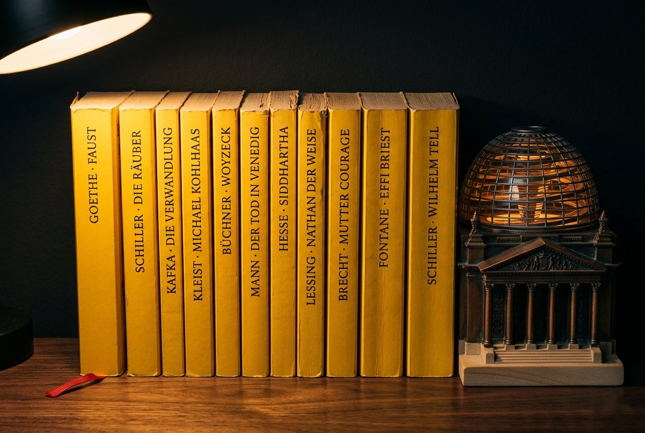
The tonal-commitment paragraph for Mauka Makai on the web side did not so much describe the site as reify it. A name (mountain to sea, Hawaiian) and a short register (refined, luxurious, tasteful) anchored every later decision, from the serif type to the thin navy gradient behind the hero. Konjugieren needed the same treatment, but in reverse. The app already existed. Its bones, namely the yellow-on-near-black palette, the small-caps structural labels, and the serif essay type, had been drifting toward a coherent identity for months without ever being named. The skill’s second commitment question (What is the tone?) was the one that made me finally name it: Reclam Nocturne.
Reclam Verlag has been publishing pocket editions of the German canon since 1867, and its small yellow-jacketed volumes (Goethe, Schiller, Kafka, Kleist, Mann) sit on every educated German’s shelf and in every German student’s backpack.2 The yellow is specific, saturated, and instantly legible to anyone who has studied the literature. Reclam Nocturne inverts the shelf into an evening study: yellow on near-black, a scholar’s reading lamp on a late-night desk. Once I had the phrase, two months of small decisions I had made half-accidentally revealed themselves to have been in service of that image all along.
The palette is tiny on purpose. customYellow is #FFCE00 in dark mode and #665300 in light, the Reclam archive yellow tuned for contrast in each direction. customBackground is pure #000000 in dark and #FFFFFF in light; the ambient surfaces are unadorned because the yellow is meant to do all the tonal work. The one other named color, customRed at #DD0000, is reserved for ablaut letters inside strong verbs, the places where the stem vowel shifts.3 The audit’s single most impactful addition was not a new named color but a system one: Color(.secondarySystemBackground), used for card fills wherever the layout now uses a card. Apple already designed that color to sit one step in from a pure background in both modes; adopting it meant I did not have to invent a surface color, which is exactly the kind of labor the skill is trying to save a non-designer from.
The typography fell out of the tone in the same way. Verb infinitives and article titles take .fontDesign(.serif), which gives them the editorial weight appropriate to content a reader studies rather than skims. The structural labels inside conjugation sections (PRÄSENS INDIKATIV, PERFEKT INDIKATIV, PERFEKTPARTIZIP, and their kin) render with .font(.subheadline.smallCaps().weight(.semibold)), a small-caps convention borrowed directly from academic grammar books. No custom font ships in the bundle. SF Pro’s design axes did all of it, an assertion I will revisit anon.
From Web to iOS
The iOS Design Agent Skill is, in spirit, a translation of the web skill’s vocabulary into SwiftUI. A reviewer of the port who is familiar with the web original will find that the original’s manifesto endures: the commitments are the same, the anti-slop mandate is the same, the five pillars are the same. What changes is the noun at the other end of each claim.
Where the web skill treats CSS custom properties as the hub of the color system, the iOS skill points at named color assets in .xcassets. Where the web skill pairs Google Fonts (a display serif with a body sans, perhaps, or a geometric sans with a technical mono), the iOS skill pairs the design axes of SF Pro itself: .serif for editorial content, .rounded for scores and numeric display, .monospaced for code and numeric stability. Where the web skill reaches for CSS transitions or Framer Motion, the iOS skill reaches for .sensoryFeedback(), .symbolEffect(), and PhaseAnimator, which give haptics, SF Symbol animations, and multi-step sequences, respectively, as single-line declarative modifiers.
Where the web skill uses box-shadow and layered transparencies to establish depth, the iOS skill uses .shadow() paired with Color(.secondarySystemBackground) for card treatments. And where the web skill conditions its animations on prefers-reduced-motion, the iOS skill conditions them on SwiftUI’s accessibilityReduceMotion environment value. The reading of the user’s preference is the same; only the property name changes.
The translation is unobtrusive. The thinking transfers perfectly. The doing requires platform fluency.
Where iOS Exceeds the Web
In three respects, the iOS translation reinterprets the web original.
SF Pro’s design axes. The web skill’s first dictum (avoid generic fonts like Arial and Inter; opt instead for distinctive choices) is expensive in iOS terms. A custom font file costs bundle size; it breaks Dynamic Type unless each weight is registered by hand; it complicates any rich-text or accessibility pipeline that hands string attributes around. SF Pro, by contrast, ships with four design axes accessible through .fontDesign(): .default, .serif, .rounded, and .monospaced. That is effectively four typefaces, all optically balanced against one another, all Dynamic Type-native, all free of bundle cost. Using .fontDesign(.serif) on a verb infinitive in Konjugieren delivers the same typographic contrast that a choice pairing Cormorant Garamond and Libre Baskerville delivers on the web, without a single font file.
Pre-designed surface hierarchy. The web skill devotes real energy to atmosphere and depth, which on the web means gradient meshes, layered transparencies, and hand-authored shadow scales. On iOS, the single most impactful surface-hierarchy move is Color(.secondarySystemBackground), a system color Apple has already tuned to sit one step in from a pure background in both light and dark modes. Its tertiary sibling, Color(.tertiarySystemBackground), sits one step further. The iOS developer does not construct surface hierarchy; he uses what UIKit already provides. In the Konjugieren audit, a single new use of Color(.secondarySystemBackground) unlocked card treatments across five screens.
Declarative motion with accessibility built in. The web skill recommends CSS transitions, scroll-triggered animations, and hover affordances, each of which a sufficiently careful web developer writes correctly and a typical web developer writes with caveats. SwiftUI’s motion primitives arrive declarative and accessibility-aware. .sensoryFeedback(.success, trigger: ...) produces a haptic tuned to the platform’s physical-feedback conventions. .symbolEffect(.bounce) produces a production-quality bounce on an SF Symbol with no tuning required. .scrollTransition() exposes the scroll position of the affected view to an animation closure without any JavaScript or IntersectionObserver. And every one of these modifiers honors accessibilityReduceMotion by default, which means the short-circuit behavior the web skill has to remember to implement is, on iOS, the baseline.
A reader who already knows frontend-design from the web will recognize most of the iOS skill’s moves. The three above are the places where she will genuinely learn something.
The Audit in Four Frames
The audit, applied to Konjugieren as my skill’s first consumer, produced twenty-four suggestions across high-, medium-, and low-severity tiers. I implemented twenty-one of them in a single commit. The full gallery of before-and-after pairs lives in the skill’s README. The four here are the ones that best show the Reclam Nocturne tonal commitment cascading into specific SwiftUI choices.
 Before
 After
After
 Before
 After
After
 Before
 After
After
 Before
 After
After
When a Design Critique Catches a Bug
One of the audit’s findings belongs in a separate category from the rest. It is not a refinement of taste; it is a correctness bug that a taste-focused review happened to surface.
Konjugieren ships with a Conjugation Tutor, a chat-style view backed by an on-device Foundation Models session that answers grammar questions about whichever verb the user is viewing. The view renders a conventional bubble UI: user messages on the trailing edge, assistant messages on the leading edge, each inside a rounded rectangle filled with a role-specific color. The audit’s comment was deadpan: assistant bubbles use Color.customBackground which is identical to the screen background; they visually disappear.
This was true. In dark mode, Color.customBackground resolves to #000000, the same value as the view’s root background, and the assistant-role bubble had been painted with it. The bubble was there. The text inside was legible. But the bubble, the shape whose entire rhetorical job is to tell the user who said this, was invisible. A prior code review I had performed, focused on correctness, had not flagged it: the view compiled, the text rendered, and the chat functioned. A design review focused on does this surface stand out from its background? caught it immediately. The fix was a single-line diff at TutorView.swift:259, swapping Color.customBackground for Color(.secondarySystemBackground), and it rode in with the rest of the audit commit.
 Before
 After
After
Not to oversell, the bug is small, it was caught, and it was fixed. But the pattern deserves a name. Correctness reviews ask does this produce the right output for the right input? Design reviews ask does this communicate what it is? Those are different questions, and a review that asks only the first will silently accept answers that fail the second.
Taste Travels
The methodology is portable. That is my thesis.
A skill written for the web, applied to an iOS app in a language whose grammar it does not speak, produced a coherent audit with specific SwiftUI targets and a tonal frame (Reclam Nocturne) that survived translation into code. The methodology was not the web’s alone. The five pillars, the anti-slop mandate, the refusal to produce nothing in particular, and the insistence on a committed tone that cascades into every detail: those are platform-agnostic. The CSS transitions, the Google Fonts pairings, the box-shadows: those are platform-specific. The first set moved to iOS without losing its force. The second set was replaced, one for one, by modifiers and system colors that SwiftUI already had waiting.
The title of this post is Borrowing Taste from the Web. What I borrowed was not CSS, and it was not the particular tonal language of Mauka Makai or Reclam Nocturne. What I borrowed was a way of committing, early and explicitly, to a tonal identity, and then holding every subsequent design decision accountable to that commitment. That is a habit of mind. I memorialized this habit in a skill, which is to say a carefully authored prompt, and it moved between platforms because the habit of mind is what the prompt encoded. The SwiftUI is downstream.
There is a second post on this topic coming in the next couple of weeks. Konjugieren’s aesthetic audit was the first half of a two-skill story I have been writing about iOS agentic development. The second skill, still in progress as of this writing, closes the other gap: it gives Claude Code (and any other Agent Skills-aware tool) the ability to run an iOS build, parse the compiler’s output, drive the simulator, and read a view’s accessibility tree, so that the agent can verify its own work without a human squinting at a screenshot.4 Design and verification are orthogonal dimensions of agentic iOS work, and neither is replaceable by the other. The design skill shipped in March. The verification skill is on deck for early May.
Endnotes
-
I write “conjugationgroup” as a single word, a choice I defended at some length in an earlier post on Konjugieren’s custom markup. The short version: what English speakers would call a “tense” (the Präteritum Indikativ, the Perfekt Konjunktiv I) is in German a bundle of tense, mood, and voice that speakers conceptualize atomically. One concept, one new word. Semantic accuracy aside, I find that welding these two English words together prevents potentially misleading two-word parsing. I brought conjugationgroup to the German localization of Konjugieren as Conjugationgroup, a feminine noun whose plural, by analogy with Gruppe ➡️ Gruppen, is Conjugationgroupen. ↩
-
The Reclam yellow is not decorative; it is a trademark. Reclam registered the distinctive shade in 1867 for its Universalbibliothek, and the color’s association with classical German literature that a student might actually read is strong enough that using it on an app’s chrome functions as shorthand for “this is serious about German.” Choosing the Reclam reference over “Goethe yellow” or “German grammar yellow” was a way of saying which shelf the app belongs on. ↩
-
Ablaut is the linguistic term for the stem-vowel alternation that marks the past forms of a strong verb across the Germanic languages. The canonical example is singen (present) / sang (preterite) / gesungen (past participle), in which the stem vowel walks i → a → u. English has mostly lost its ablaut, sing/sang/sung notwithstanding, but German has kept it in robust health, and reading off the three principal parts of a strong verb is, for the learner, the work of memorization that no rule can replace. ↩
-
A numeric sketch of why that matters: querying a SwiftUI view’s accessibility tree costs a few hundred tokens, whereas analyzing an iOS screenshot costs roughly 3,200. A loop that verifies its own UI through structured accessibility data is materially cheaper, and more precise, than one that verifies through vision. I thank Conor Luddy for this insight. ↩